Aaroogya AI Foundation · UX Design · 2025
Aaroogya AI Foundation builds AI-powered tools used by
community health workers during doorstep patient visits. This
case study focuses on designing onboarding that people could
actually use without hesitation.
54%
Activation Rate
+12%
Retention
CHW+
Patient Scope
CHW Onboarding · Patient Flow

How It Started
The Organisation
Aaroogya AI Foundation
Builds ethical AI solutions for underserved
communities. Care is delivered through
CHWs who visit patients door to door.
Previous System
My Healthline
AI-led screening through structured
questionnaires. Built 5–6 years ago to
standardise care at scale. CHWs focused
more on completing the app flow than on
the patient sitting in front of them.
The Solution — AAHA
AI Companion for CHWs
AI needed to support healthcare workers
without getting in the way of patient
interaction. The system had to recede so
the human connection could flourish.
Why I Chose to Work on This
Personal motivation — where technology met human empathy
I come from an IT background. AI always interested me as a too
to simplify complex workflows — not as a buzzword, but as
way to make systems scale without increasing complexity for
the people using them.
Years ago, my grandmother hid her illness because she didn't
want to worry anyone. That hesitation — not wanting to be
burden — is something I've seen reflected in how many women
approach healthcare today. When I interacted with CHWs, that
connection became clearer.
I chose to work on this because it sat at the intersection of
technology, healthcare, and human behaviou — and because
getting it wrong would fail quietly, through loss of trust
Design
Onboarding flows · Patient case file · AI
assisted chatbot
Testing
Usability testing with real CHWs in the field
Collaboration
Worked directly with developers throughout
Stakes
First onboarding AAHA would ship with — if it
failed, the app would simply stop being used.
Meet the user
Community Health Workers · Primary Users
Who they are
Women in their 30s–40s, married with young children at
home. Community health workers visiting patients door to
door.
Daily tech use
Used smartphones regularly — calling and messaging on
WhatsApp. Familiar with phones, not with forms.
Responsibility in AAHA
Creating their own account, onboarding patients during field
visits, and assessing the patients.
What we assumed (wrongly)
Healthcare workers, so structured forms and reading
instructions wouldn't be a barrier. Every session
proved this wrong.

Designing the First Version
01
Existing Research
Started from earlier interview
notes and preliminary sketches
to ground the work in real
observations.
02
Early Exploration
Generated flow variations
quickly to test different
onboarding paths using Miro AI.
03
Internal Review
Walked through with team to
catch friction before real users
encountered any issues.
04
Prototype to Build
Refined into screens, reviewed
directly in the development
environment for accuracy.
Journey 01
CHW Onboarding
Name and contact information
Professional details, years of experience
Hospital or organisation name
Area of expertise
Journey 02
Patient Onboarding
Name, age, and phone number
Spouse name and emergency contact
Aadhaar number for identification
Profile photo and address

CHW Onboarding
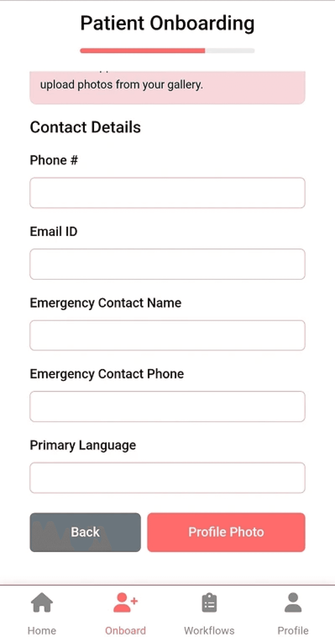
Patient Onboarding — 1
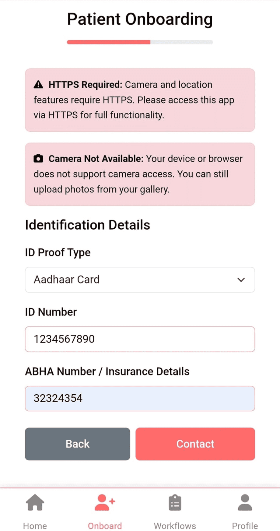
Patient Onboarding — 2
Testing With CHWs
Observation 01
They paused before the very first tap
Sign up vs sign in — they looked for a long time. Email and password
fields made them hesitate before touching anything.
Observation 02
They read everything. Slowly. Then weren't sure.
They read slowly. And even after reading, they weren't sure what was
being asked. Every action delayed — not from carelessness, but from
trying hard not to make a mistake.
Observation 03
Positive feedback, visible stress
No one abandoned the flow. When asked, many said it was "fine" or
"better than My Healthline" — even though the hesitation was visible
throughout.
Observation 04
Warm before the app. Quiet after.
The same people who were relaxed during introductions became
cautious the moment the phone was in their hands.
The real problem — repeated across sessions
"Aage badhu ab?"
They were seeking permission, not instruction. One CHW called over her daughter and
said she helps because she is "smart." When something went wrong, they were ready
to blame themselves — not the app.
This wasn't a usability flaw. It was a trust problem. If the app made community health
workers doubt themselves, it would never become part of their daily work.
What I Chose to Fix and Why
Fix 01
Language Support
Language as communication, not translation
CHWs rarely said they didn't understand the app. They said it would be better if it was in Marathi. What we observed
was not a lack of literacy — but a lack of confidence while moving forward.
Fully translating the onboarding flow wasn't possible — identity fields like Aadhaar required precise English. Instead, w
captured preferred language during onboarding and applied it to the rest of the product — reducing friction during rea
patient interactions while preserving accuracy in identity inputs.


Fix 02
Entry Clarity
Making it clear where to begin
On the first screen, users spent time deciding between signing in and signing up. Even before entering any information
uncertainty had already crept in.
We improved the visibility and clarity of the primary action so that the starting point was obvious. It was a smal
change — but it set the tone for everything that followed.

Fix 03
Error Recovery
Removing the fear of irreversible mistakes
Throughout onboarding, users behaved as if every action was final. Passwords, credentials, and form entries fel
permanent. If something went wrong, they assumed it couldn't be fixed.
Introducing reversible actions — especially password recovery — reduced that anxiety. This didn't speed the flow u
dramatically. It made people less afraid of continuing.

Fix 04
Reduced Friction
Shortening the path without oversimplifying it
The original onboarding flow required users to move through several screens before reaching the main application
Reducing the number of steps helped lower cognitive effort and allowed CHWs to reach the working part of the syste
faster.
What Changed
Community health workers stopped asking for permission before moving forward
They hesitated less at the start. The flow no longer felt like something that require
supervision.
Before
—
Asked permission before every step
—
Called family members for help
—
Blamed themselves when things went wrong
—
App felt like an extra task
After
—
Moved forward without asking
—
Needed less external reassurance
—
Recovered from mistakes independently
—
App became part of daily routine
54%
Activation Rate
Up from 2–5% during early MVP testing. As
onboarding friction reduced, the barrier to
starting had lowered significantly.
+12%
Retention
CHWs weren't just completing onboarding
— they were returning to the app
independently, across different states.
+2%
Completion
From reversible actions and password
recovery alone. At MVP scale, these
increments showed CHWs felt confident
using the system.
What I Deliberately Did Not Ship Ye
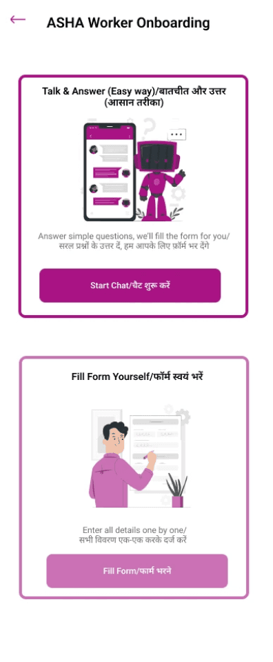
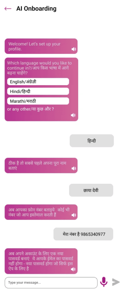
V2 Concept
One example was an AI-assisted onboarding concept where the
system could guide CHWs through account creation using a
conversational interface instead of traditional forms. The idea was
appreciated — but implementing it required deeper AI infrastructure
and engineering bandwidth not feasible within the V1 timeline.
The priority was clear: stabilise what users already trusted before introducing something new.
What This Taught Me
Understanding users is not a
preliminary step. It is the work.
Assumptions — even well-intended ones — can quietly break a product. Without context,
even thoughtful decisions miss the mark.
Constraints sharpen thinking.
When timelines and resources are fixed, the quality of decisions matters more than the
quantity of ideas.
Patterns don't travel well unless user
contexts do.
I referenced an app built for tech-comfortable doctors. Applying those patterns to
underserved CHWs didn't translate — and that gap taught me something I won't forget.
Hesitation says more than direct
feedback.
Silence, slowed actions, and pauses signal what users won't articulate. Learning to read those
shaped every decision I made here.
Shivya Tripathi · Product / UX Designer
Home
Work
About
Contact
© 2025