Redesigning YouTube's Learning Habit Loop
Product Design · Behavioural UX
YouTube · Self-Initiated
27 Users Surveyed
27
Users researched
4
Design
interventions

When "Save for Later" Started Feeling Like Avoidance
The Moment It Hit Me
A Watch Later list full of things I never finished
I opened my Watch Later list one evening and realised something strange: I had saved dozens of learning videos… and finished almost none. Not because they weren't useful — but because returning to them felt heavier than it should.
The False Dopamine Hit
Saving felt like progress — even when it wasn't
Saving a video gave me a tiny dopamine hit, as if I'd already taken the first step. It felt productive — even though nothing had actually happened.
The Return Problem
Days later, the motivation was completely gone
Instead of excitement, I felt guilt and hesitation: "What if I start this and realize I can't actually do it?" Suddenly the list wasn't helpful — it was a quiet reminder of everything I'd postponed.
The Core Realisation
YouTube captures intention but abandons follow-through
YouTube's Save feature protects the moment of inspiration but abandons the user when it's time to act. The gap between saving and starting was the design problem nobody was solving.
The question that sparked the entire case study
What Really Happens Between "Save" and "Start"
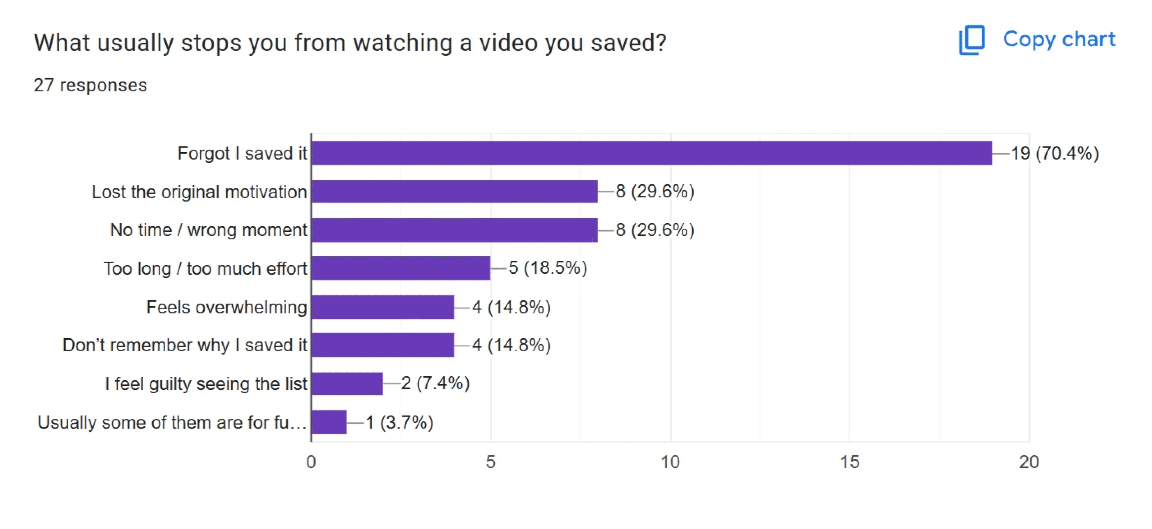
Finding 01 · 27 Users
Almost everyone saved. Almost no one returned.
Across 27 users, saving videos was nearly universal. But returning
to them? Rare. The intention exists — the follow-through doesn't.
This gap became the core tension to unpack.
Finding 03 · Context Collapse
When they return, everything has changed
By the time they revisit, their context, energy, and motivation are
completely different. The video now looks long, effort-heavy, or
irrelevant. Learners ask: "Is this worth the energy right now?" Often,
the answer is no.
Finding 02 · Emotional Peak
People save during high-motivation moments
Survey patterns showed a consistent signal: people hit "Save"
when they're inspired, planning a better version of themselves. It's
an emotional peak — the future feels full of potential. But that
emotion fades faster than we think.
Finding 04 · The Lost Why
Forgetting the 'why' is the biggest breakdown
The survey repeated this constantly: "I forgot why I saved it." "Lost
motivation." "Don't remember the intention." When the emotional
reason disappears, the video becomes just another item in a pile.
Time was never
the real excuse.
Finding 05 · The Contradiction
Users claimed "no time" — but binged short-form content daily
The same users who said they had "no time" for their saved videos were spending hours on
Shorts and Reels. Time wasn't the truth — the emotional cost of starting was. The Watch
Later list wasn't a scheduling problem. It was a psychological one.
User Journey: From Motivation to Avoidance
Stage 01 · Discovery
The Hopeful Save
What Happens
User finds a how-to video that feels
inspiring, useful, or like the "future me"
they want to be.
"Oh I need this… just not right now."
Key insight: Saving begins with
identity hope, not readiness. The
motivation is real — but it's borrowed
from a future self.
Stage 02 · Save
The False Win
What Happens
They hit "Save" because it feels like
progress. Dopamine replaces real effort.
The item goes to a list. The feeling
disappears.
"Cool, I'll do this later."
Key insight: Saving gives the brain a
psychological reward → reduces
urgency to act. Completion becomes
optional in the mind.
Stage 03 · Return
The Avoidance Spiral
What Happens
They open the saved list but feel
instantly intimidated. Every unfinished
video feels like failure. The list has
become a graveyard.
"Ugh… I'll do this later."
Key insight: The lack of structure kills
momentum. Even high-intent users
disappear. The design fails exactly
when the user needs support the
most.
Design Opportunity: Where YouTube Can Intervene
Based on the journey breakdown, these were the moments where design could meaningfully shift user behaviour — without forcing motivation or adding pressure.
Make Returning Feel Emotionally Safe
Return → Avoidance
Right now, Watch Later feels like a graveyard of abandoned intentions. I needed to turn it into a space where the user feels trust, not guilt — a place where the smallest action is acknowledged and respected.
Help Users Remember Why They Saved Something
Save → Delay
The emotional spark that triggered the save is gone by the time they return. If YouTube can surface even a fragment of that original intent, motivation instantly rises.
Shrink the First Step Until It Feels Non-Threatening
First action after return
Users avoid tasks that feel big, fuzzy, or demanding. So the first step has to feel tiny — so small it cannot threaten their identity, time, or mental energy.
Create Momentum Through Micro-Wins
Continued engagement
Once someone starts, they need visible proof of progress. Not gamification. Not dopamine spam. Just honest, momentum-building nudges that make continuing feel easier than quitting.
Concept Direction
Research revealed that users don't abandon saved learning videos due to lack of interest. Instead, saving creates a false sense of progress, while returning later introduces confusion, guilt, and overwhelm.
The concept direction focuses on supporting users precisely at moments where intent still exists but structure is missing — helping them move from "I'll do this later" to taking the first small step.
Design Goal
Enable users to convert saved learning intent into small, achievable actions without breaking their flow or overwhelming them.
◎
Clarity
Help users immediately understand what to do next when
they return to a saved video, reducing decision paralysis.
→
Momentum
Break learning into micro-steps that feel easy to start,
preventing intimidation and procrastination.
⌘
Guidance
Offer explanations only when needed, allowing users to
learn while doing without interrupting their flow.
Explanations are optional, not forced — users can act without understanding everything upfront
Progress is visualised through small wins — not completion metrics or gamification
Users can act without needing to understand everything — learning happens while doing
Translating Strategy into Interface
01
Design Decision · Priority Surface
Prioritising unfinished tasks on retur
Problem: Users returning to saved videos face overwhelm and indecision — intent fades into clutter
Solution: By surfacing the unfinished video at the top, we reduce choice overload and give users a clear next step.

Unfinished First
02
Design Decision · Emotional Safety
Framing return as continuity
Problem: Reopening a saved video feels like starting from zero — threatens identity and increases avoidance
Solution: The "resume where you paused" state reinforces progress and emotional safety, letting users continue with confidence

Clear Next Step
03
Design Decision · Micro-Steps
Guided micro-steps for action
Problem: Long unstructured videos are intimidating — users struggle to know where to begin
Solution: Breaking content into step-by-step actions creates achievable chunks, maintaining momentum without overwhelm.
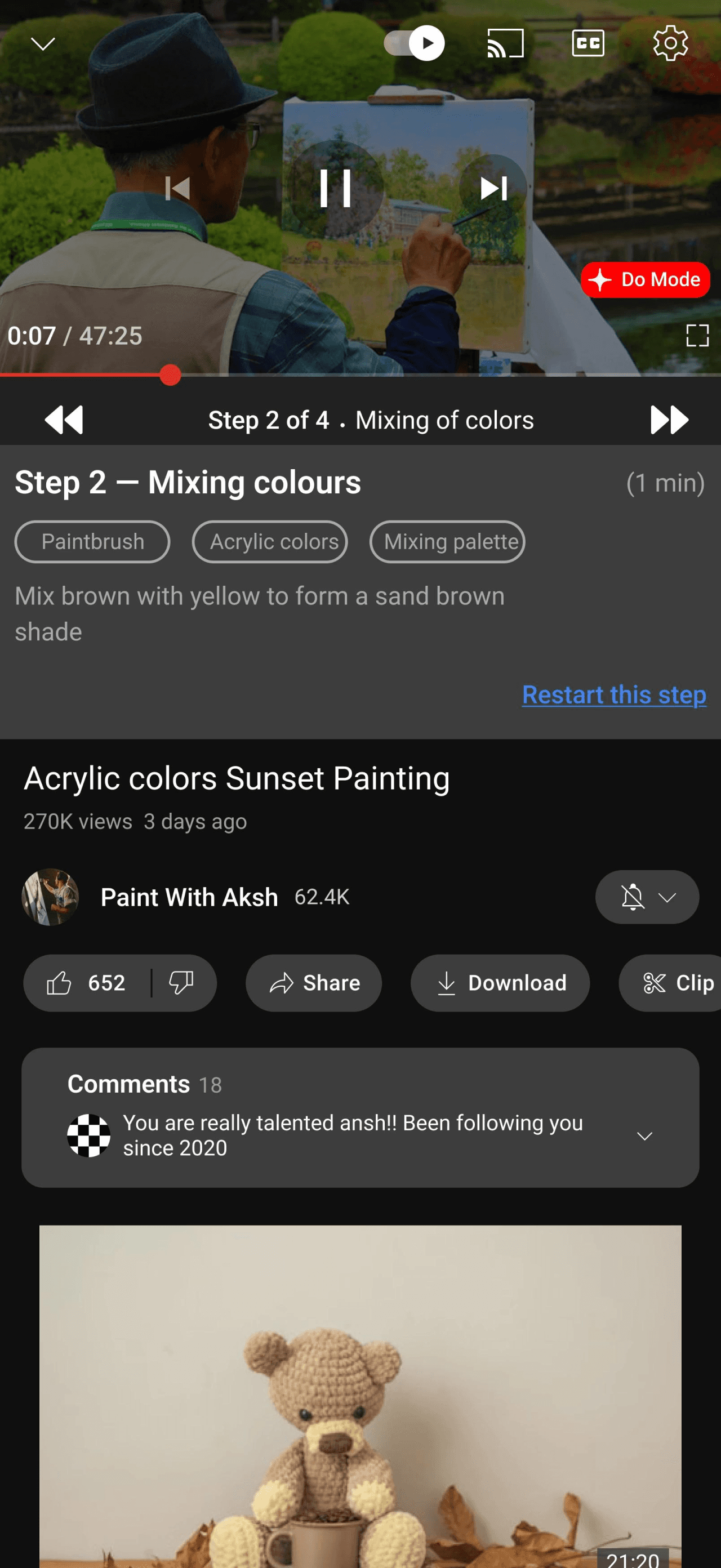
Step-by-Step View
04
Design Decision · Identity Reinforcement
Reinforcing learning identity
Problem: Users need reinforcement that progress matters, not just completion of a video.
Solution: A lightweight celebratory screen acknowledges effort and nudges users toward the next skill — making continuation feel
natural.
Step-by-Step View

Actionable Chunks
Why This Works
◈
Reduces Cognitive Overload at
Return
Surfacing one clear next step prevents
users from feeling overwhelmed when
revisiting saved content.
▸
Builds Momentum Through Micro-
Wins
Breaking long videos into guided steps
creates visible progress, making
continuation easier than quitting.
↩
Lowers the Activation Barrier
Framing progress as "resume" instead of
"restart" makes the first action feel small
and non-threatening.
✦
Reinforces Learning, Not
Completion
Lightweight celebrations validate effort and
encourage users to start the next task with
confidence.
◉
Preserves User Identity
Acknowledging partial progress protects
users from feeling incapable — reducing
avoidance and guilt-driven drop-off.
≋
Improves Retention Without
Disrupting Flow
Contextual nudges appear only when
relevant — maintaining speed while quietly
supporting learning behaviour.
Together, these decisions transform "Watch Later" from a passive list into an active
learning loop — increasing completion, repeat engagement, and long-term user
confidence. The goal was never to make users more disciplined. It was to make the
experience match how people actually work.
Looking Beyond the Solution
Reflection
The real problem was never motivation
Designing for completion made me realise that the real problem wasn't motivation — it was emotional safety. Users weren't lazy or inconsistent; they were protecting their identity from feeling incapable.
By shifting the experience from "finish later" to "continue where you left off," the design reframes learning as a process instead of a performance.
The most important UX insight: sometimes the barrier isn't the product. It's what the product makes people feel about themselves.
What I'd Explore Next
If this were taken further
I'd explore adaptive step sizing based on user behaviour patterns — shorter steps when someone hasn't returned in a while, longer when they're in a flow state.
Creator-authored step breakdowns would let content creators define the learning path themselves — making the structure more intentional and the completion more meaningful.
Finally, reflective prompts that help users internalise what they've learned — not just complete tasks. Learning is only useful if it sticks.
Shivya Tripathi · Product / UX Designer
Home
Work
About
Contact
© 2025